
The color scheme of the Change Lyric Video is identical to those colors used for the Change Campaign. White was used mainly for those lyrics that are less important. The three remaining colors: Skin, Green, and Red where used to highlight those more important lyrics.
Both of the verses follow a parallel structure. They use more syllables per frame compared to the chorus. Meaning that the verses present phrases whereas the chorus presents words and sometimes even single syllables.
More syllables per frame (verse) Less syllables per frame (chorus)
More syllables per frame (verse) Less syllables per frame (chorus)


The horizontal expanding of particular words was used, both in the verses and chorus, to imitate the more legato notes being sung. Such as HERE and STILL in the verse and MYSELF, STILL, and MOVING in the chorus. The horizontal expanding of the words STILL and MOVING also has an alternate significance. The movement for the word still is a contradiction, however this was intentional as nothing remains completely still. Whereas the movement for the word MOVING is literal.

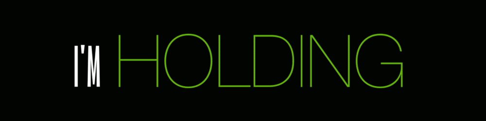
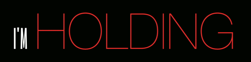
The changing of the size and color of the fonts for the phrase I’M HOLDING was used to illustrate resistance. The more things continue to change the more resistance is applied. Thus more equals greater. And greater was illustrated by increasing front size and using more vivid colors. I realize white is the combination of all colors, so technically one can suggest white is greater than any vivid color. However, I wasn’t suggesting greater in a technical sense, but more of an aesthetic one. Meaning the greater the saturation the greater the significance.

The HOLD ON, first seen at the end of the second verse, utilizes a very large font that flashes in the background. This was done to create the feeling of an emergency like signal. Warming the individual singing about the forthcoming change.


No comments:
Post a Comment